Fifty years ago, Baron Marcel Bich, founder of the eponymous company, acquired Château de Ferrand.
In 2025, the Bich family opens a new chapter by unveiling a new identity, a tribute to the family’s history.

a unique label
Created using a BIC® ballpoint pen, this label is an extension of the family art collection housed in the château.
The hand-drawn illustration is a unique way of honouring the past while writing the future. An authentic line, born of a simple and precise gesture, reflecting the craftsmanship and precision required to produce a great wine.
This label also highlights the estate’s ecosystem: like an ode to nature, it reflects Ferrand’s deep attachment to its environment as well as its commitment to preserving it.
Revealed during the 2025 Primeurs, the 2024 vintage of Château de Ferrand is the first to bear this new label.
“This new label is an essential milestone for Château de Ferrand.
A humble illustration of who we are, who we have been, and who we will be.”
Pauline Bich Chandon-Moët

a distinctive logo
The new Château de Ferrand logo is distinguished by its blue color and especially its ellipse – a hand-drawn gesture made with a BIC® pen, echoing the illustration on the label.
A new logo that combines elegance and modernity, reflecting the character of the estate’s wines.
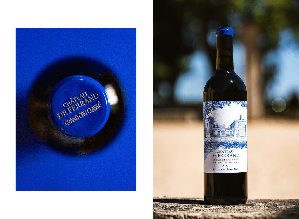
“blue” as a new signature
The blue tone chosen for the label, the cap and the logo, serves as the new chromatic signature of Château de Ferrand.
Far from being arbitrary, the choice of blue isreminiscent of the ink from a ballpoint pen andcreates an authentic link between the estate’s history and the Bich family.